Hexawise recent updates
Hexawise recent updates
Automate: Export performance on very large test scripts
Another area of Hexawise Automate performance that could be affected by large test scripts on large test plans was the Gherkin feature file export. The performance of this export has been improved substantially for large test scripts.
Automate: Doesn't include rows not gaining any coverage
While Hexawise Optimize will only include test cases that newly cover some pairs (or triples, quadruples, etc.) of parameter values, not every single parameter value in a generated test case will always be covering previously uncovered pairs. Parameter values in a generated test case that aren't involved in providing any new coverage are shown in In purple italics.
In Scenario and Scenario Outline blocks in Hexawise Automate test scripts you may utilize only a subset of your test plan's parameters, just those that you end up including with angle bracket <Parameter name> and curly bracket {[Parameter name] Parameter value} syntax. In this way, it's possible that for some of your generated test cases, the subset of parameters you are using in the block all contain only values in purple italics. In other words, it's possible that some generated test cases don't provide any additional coverage for the subset of parameters.
In those circumstances, Hexawise Automate was still including all generated tests cases in the Examples data table or in the generated Scenario blocks. Now Hexawise Automate determines if any of the generated test cases provide no needed coverage for the subset of parameters and removes those generated test cases from the Example data table or the generated Scenario blocks so there are fewer test cases to test.
"Share a project" as the suggested next achievement was a broken link
100% less broken now.
Constraint highlighting for implied constraints
Implied constraints are added automatically by Hexawise in reaction to the constraints you add manually. Hexawise is able to work out most of the logical implications of constraints, and add those implications in for you. This saves you needing to add them yourself, or worse, leaving them missing, resulting in parameters with no possible value in generated test cases.
Ever since implied constraints, a unique and innovative time saving feature, was introduced in Hexawise, they've been shown in partial transparency alongside user generated constraints in the grid of parameter values in the constraint user interface. While this holistic view can be very important to understanding the complete picture of how your test plan is constrained, it can also result in a busy picture when you want to understand just the constraints you added to the test plan, and not their logical implications.
We've changed the constraint UI so that implied constraints are only included in the grid when you expand the disclosure triangle to show the list of implied constraints for your test plan. This gives you the control to see just your manual constraints in the grid, or to see the complete constraint picture.
Automate: Performance on very large test scripts
Automate performance has degraded quite rapidly as the size of the test script grows past a few hundred lines. Not many Gherkin scripts get to this size - even less now that Hexawise Automate supports multiple feature files per plan (tabs in Hexawise Automate) - but those that do would hit a performance cliff.
Some small but very important changes were made to remove this bottleneck, and the performance of test scripts with many hundreds to thousands of lines is now nearly the same as it is on very small scripts.
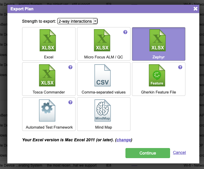
Zepyhr Jira test case management export
You can now export your Hexawise test plans for use in SmartBear's Zephyr Jira test case management tool.

Automate: Better feedback on overconstrained scenarios
In Scenario and Scenario Outline blocks in Hexawise Automate test scripts, you can select a subset of your test plan's generated test cases by using the curly bracket {[Parameter name] Parameter value} syntax. In this way it is possible though to over constrain the block and end up with an empty subset of your generated test cases. If this happened, Hexawise Automate wasn't especially helpful in the preview pane in letting you know what has happened. This has been improved to be more helpful.
Finicky horizontal scrollbar in Define Inputs and Constraints user interface
On larger plans that required both a vertical and a horizontal scroll bar in the Define Inputs and Constraints user interfaces, the horizontal scrollbar would often not appear until you scrolled first some way down the UI with the vertical scrollbar. This has been fixed.
Automate: Gherkin syntax error highlighting
Hexawise Automate now does a better job of pointing out lines in your Gherkin features that contain invalid Gherkin syntax.
Manual auto-script autocompletion
The autocomplete drop-down (invoked with the { character) now better handles parameter names with spaces and special characters.
Navigating away from the field with the autocomplete drop-down open no longer strands it open.
Issue reverting plans
A regression in the Hexawise Automate portion of the plan importer impacted the ability to revert plans to a previous version in some cases.
Automate: Don't allow value expansions to cause additional test cases
Hexawise Automate creates as few rows in the Examples data table of a Scenario Outline or as few generated Scenario blocks as possible.
Specifically, Automate only includes unique rows or generated Scenario blocks. While every generated Hexawise test case is, of course, a unique case, a Scenario or Scenario Outline in Hexawise Automate can include just a subset of parameters in the test plan, such that the subset is not unique for every generated test case. In those cases, Hexawise Automate will use fewer test cases for the Scenario or Scenario Outline, only the unique cases.
Automate was treating the value expansions of a single parameter value that is expanded with value expansions (an equivalence class) as unique, rather than treating these value expansions as equivalent, and therefore not contributing to a test case subset being unique. This issue is now fixed.
Automate: Script renaming bypassed some script name validations
Always a tricky sort of pairwise defect. Have you thought about the different ways a user can take the same action? In this case, naming a test script.
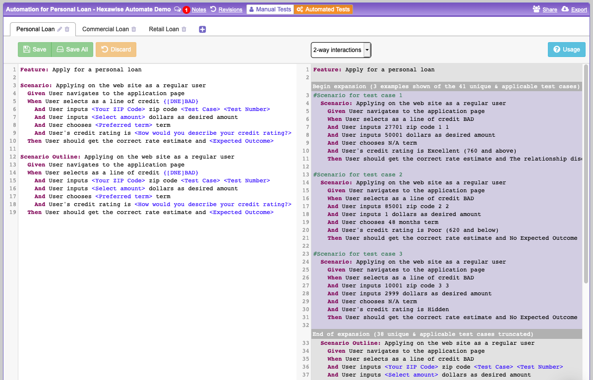
Hexawise Automate 2.0!

Usage of Hexawise Automate has been skyrocketing and we felt it was time to act on what we've learned. This update has been months in the making, but we're proud to release it today. Thanks to everyone for all the great suggestions on how to improve Hexawise Automate.
Here's what we did:
- Create multiple features per test plan in a tabbed interface
- Live preview of
Scenarioexpansions as you edit without having to export - 94.3% less janky and unpredictable
- Speed, speed, speed
- Helpful error messages for invalid syntax and semantics
- Discard unsaved changes
- More complete and helpful usage hints, just a button click away
- Autocomplete
Scenario OutlineandScenariowith just the keyword, or a full snippet - Dozens of fixes and quality of live improvements
Please let us know what you think about the changes and keep the suggestions coming!

Missing purple in the purple italics!
A regression caused the famous purple italics, which indicate a test case parameter value is not being used to achieve combinatorial coverage and can be changed, to become simply italics. No purple!
The responsible developer has been identified and dealt with in a severe manner.
Complete the "Share a Project" achievement using the share URL
You can complete this achievement now by using either the named user invite or the share URL.
Unable to complete the "Share a Project" achievement
There was a regression that prevented this achievement from working properly unless the project was shared with a new user to Hexawise (a pairwise regression, in case you are keeping track at home).
Thank you to Ankur for first reporting the issue.
Tricentis Tosca Commander integration
There's now a new option when exporting a plan to target the export to Tricentis' Tosca Commander.

You can learn more about how the Hexawise / Tosca integration works in this article.
Email top level domain validation
Updated the validation of top level domains in email addresses during new user registration to account for recent new top level domains.
Overly agressive auto-completion on tab in the new parameter dialog
When defining a new parameter in the new parameter dialog, it wasn't possible to use tab to move to the parameter value list without triggering an auto-complete of re-using an existing parameter. This made the dialog more cumbersome to use than it needed to be, necessitating use of the mouse. This is resolved.
Mindmap SVG export now can be easily opened in a browser
The option to export a Mind Map as an SVG was limited to behaving correctly in SVG viewers/editors that relied solely on the .svg file extension, and not on a correctly formed svg XML root tag with the 3 standard XML namespaces. Recently browsers have started to use the strict svg root tag to decide whether to show the SVG rendered as an image, or to show it as XML data only.
Hexawise now exports a correct svg root tag so the SVG export will open and display as an image in common web browsers.
Export / Share links not appearing in some edge cases
Relatively unusual sequences of plan modification (sequence of behavior is an oft overlooked source of pairwise variation) would result in either or both of the "Export" and "Share" links not appearing in their normal spot in the top right of the central UI panel until the user navigated away or refreshed the page.
Improved performance when generating implied value pairs (constraints) - Part 2
Users were having to wait too long for the implied pair generation logic to be performed when working with very large test plans that were heavily constrained. We made two changes to dramatically improve the performance in many of these cases. The second of these changes involved breaking the large logic resolution problem into smaller, simpler, independent problems were possible, and is now complete.
Performance and UI feedback when matrix chart is calculating for very large test plans
Moving the slider on the matrix chart on extremely large and heavily constrained test plans was not performant enough, and did not provide sufficient feedback that calculations were in progress. Both of these issues have been addressed with fewer interstitial calculations being performed, memoization of prior calculated results, and UI feedback while results are being calculated.
Improved performance when generating implied value pairs (constraints) - Part 1
Users were having to wait too long for the implied pair generation logic to be performed when working with very large test plans that were heavily constrained. We're making two changes to dramatically improve the performance in many of these cases. The first change is complete.